
For most brands, consistency is considered the ultimate branding virtue. One logo, one visual identity, one unified message. The logic is simple: consistency drives recognition, and recognition builds trust.
But as brands scale across markets, generations, and consumer segments, a new challenge emerges. The same identity that resonates with one audience may feel irrelevant to another. A symbol that appeals to a professional athlete may not carry the same meaning for a sneaker collector. A brand built for performance may struggle to connect with consumers who are buying for culture, fashion, or lifestyle.
The challenge for modern marketers is no longer consistency alone. It is relevance at scale.
This is where Adidas offers an interesting case study.
Rather than forcing a single logo to speak to every consumer, Adidas has built a brand architecture around three distinct visual identities. While each logo serves a different audience and purpose, all are connected by the company’s iconic three-stripe DNA. The result is a system that allows Adidas to address multiple consumer mindsets without fragmenting the parent brand.
At first glance, the three Adidas logos may appear to be a design choice. In reality, they are a segmentation strategy.
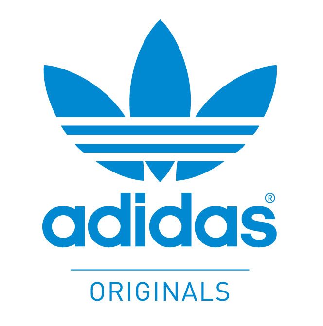
The Trefoil logo, used primarily under Adidas Originals, targets consumers who engage with the brand through culture, heritage, and fashion. This audience is less concerned with athletic performance and more interested in identity, self-expression, and cultural relevance.
Products such as the Samba, Superstar, and Stan Smith have evolved beyond sportswear into cultural icons. For these consumers, Adidas is not simply a sports brand. It is a lifestyle signal. The Trefoil acts as a visual shorthand for authenticity, nostalgia, and street credibility.
In marketing terms, the Trefoil serves consumers who buy into the brand’s story and legacy as much as its products.

{Image of Performance Logo}
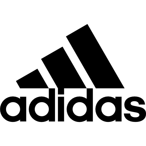
The Performance logo addresses a very different audience.
Built around competition, achievement, and athletic excellence, it is the face of Adidas’ performance business. From professional athletes to serious fitness enthusiasts, this segment seeks products designed to help them perform better.
The visual language reflects that positioning. The sharp, ascending bars communicate ambition, progress, and discipline. Every touchpoint, from sponsorships to product launches, reinforces the idea that Adidas is a performance-first brand.
For this audience, functionality and results drive purchase decisions.
The third identity, the Badge of Sport, serves the growing athleisure and everyday sportswear market.
These consumers sit between the previous two groups. They appreciate the credibility of a sports brand but are not necessarily training for competition. They want versatility, comfort, and style that fits seamlessly into daily life.
As sportswear increasingly becomes everyday wear, this segment has become one of the most commercially significant opportunities for global apparel brands. The Badge of Sport allows Adidas to compete in that space without diluting the positioning of either Originals or Performance.
Viewed independently, these logos represent different parts of the Adidas business. Viewed collectively, they reveal a sophisticated approach to brand management.
Adidas is not managing three logos. It is managing three consumer identities.
The Trefoil speaks to culture.
The Performance logo speaks to achievement.
The Badge of Sport speaks to everyday versatility.
Yet all three remain unmistakably Adidas because they are anchored by the same three-stripe visual system. The company has created flexibility at the surface while maintaining consistency at the core.
This approach reflects what brand strategists often describe as a hybrid architecture — a model that combines the strength of a master brand with the relevance of targeted sub-brands. Consumers receive messaging tailored to their motivations, while the parent brand continues to accumulate equity across every interaction.
The effectiveness of this strategy becomes particularly visible when Adidas moves these identities across categories and moments. In 2026, the company reintroduced the Trefoil logo on away kits for 25 national football teams competing at the FIFA World Cup. The decision was more than a design update. It represented a deliberate effort to blend football performance with fashion culture, tapping into both sports fans and lifestyle consumers simultaneously.
For marketers, the lesson extends far beyond logos.
First, not every audience needs the same story. Different customer segments often require different emotional entry points into the same brand.
Second, consistency does not mean uniformity. Strong brands maintain a common foundation while adapting how they express themselves to different audiences.
Third, brand architecture should shape marketing strategy. Before building campaigns, brands need clarity on who they are speaking to and what role they play in that consumer’s life.
Finally, visual identity is often market segmentation made visible. Every logo, symbol, and design system communicates not only what a brand is, but also who it is for.
In a world where consumers increasingly move between sports, fashion, culture, and lifestyle, Adidas demonstrates that the strongest brands are not always the ones with the simplest identities. They are the ones that can speak multiple languages while remaining recognisably themselves.