

A logo is often the first thing a consumer remembers about a brand, but for a telecom company, it can become much more than a visual signature. It can represent an era, a business strategy, and even the changing expectations of millions of customers.
Few Indian brands demonstrate this better than the journey from Hutch to Vodafone and, eventually, Vi. Now, in September 2026, Vi has once again altered its visual identity, giving its familiar mark a new dimension and bringing Shah Rukh Khan into the picture.
What looks like a small change in a logo is, in fact, the latest chapter in a two-decade-long story of transformation. (Source: business-standard)
It Started With Hutch — And a Brand People Could Feel
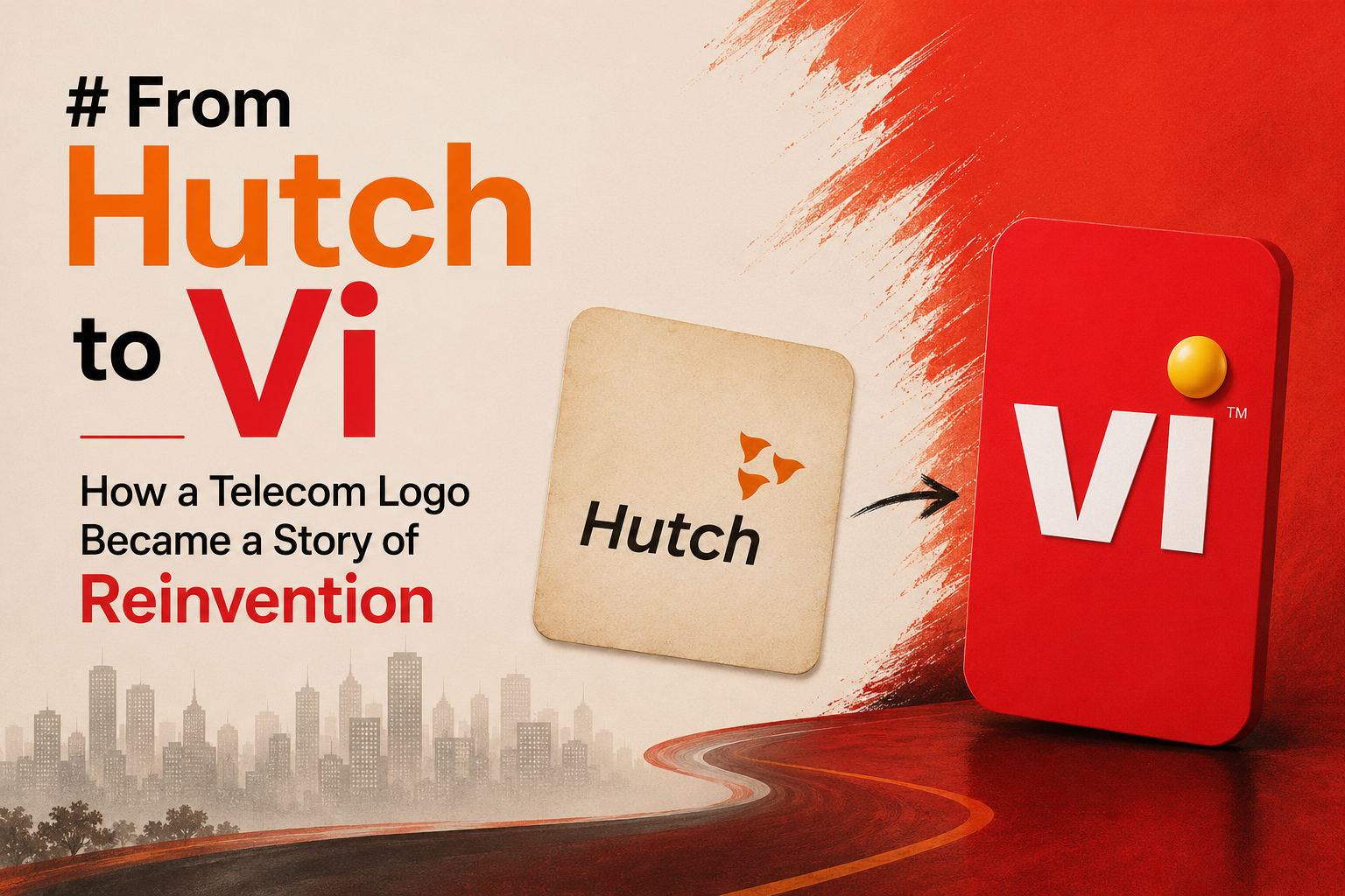
Before Vodafone became a familiar name in Indian telecom, there was Hutch. The Hutch brand that dominated Indian advertising in the mid-2000s was built around simplicity, warmth, and memorable storytelling. Its clean typography and distinctive orange-and-white imagery gave it a personality that was noticeably different from the hard-selling communication common in telecom at the time.
The famous pug campaign further strengthened this emotional connection, turning a telecom network into something consumers could recognise through a character rather than a technical promise. The brand’s advertising strategy became one of its biggest assets, demonstrating that telecom could be sold through emotion as much as connectivity.
But the market was about to undergo a major corporate shift. In 2007, Vodafone acquired a controlling stake in Hutchison Essar in a deal valued at around $11.1 billion, and Hutch was subsequently rebranded as Vodafone India. With that transition came one of the most recognisable logos in Indian telecom: Vodafone’s red speech-mark-style symbol paired with its lowercase wordmark. (Source: sec.gov)
While the identity was new to Indian consumers, Vodafone was not starting from zero globally. Its red-and-white visual language had remained a consistent part of the brand’s identity through earlier iterations, helping give the new Vodafone India brand a recognisable global signature.
From Orange Emotion to Vodafone Red
The shift from Hutch to Vodafone was not simply about replacing one name with another. It was about bringing a global identity into the Indian market while retaining the emotional familiarity that Hutch had created. Vodafone continued using some of the storytelling assets associated with the earlier brand, including the much-loved pug, allowing the transition to feel less like an overnight replacement and more like an evolution.
Over the next decade, the Vodafone identity itself changed. The now-iconic red circular mark with the white comma-like symbol was introduced in 1997, giving Vodafone a visual identity that would remain recognisable across markets for decades. The design was distinctive enough to become closely associated with the brand itself, rather than simply functioning as a corporate logo.
The 2006 redesign had given Vodafone’s red symbol a more three-dimensional, glossy treatment, but the 2017 redesign reversed that direction, bringing the flat design back and refining the contours of the emblem. The shift reflected a broader movement towards simpler, more adaptable identities suited to digital environments.
However, the biggest transformation was still ahead. Vodafone India and Idea Cellular had announced their merger in 2017, and the transaction was completed in 2018, creating Vodafone Idea. Yet the corporate merger did not immediately mean that consumers would see a completely new consumer brand. That arrived in September 2020, when Vodafone Idea introduced Vi, combining the identities of Vodafone and Idea into one unified brand.
Vi Was More Than a New Name
The arrival of Vi represented an attempt to move beyond the legacy of two separate telecom brands. The logo brought together a bold red V and i, accompanied by a distinctive yellow visual particle positioned beneath the “i”. It was compact, contemporary, and designed for an increasingly digital consumer environment.
Importantly, the logo was also a visual expression of the merger itself. Vodafone and Idea were no longer being presented as two competing identities under one corporate umbrella; they were being turned into one consumer-facing brand. The simplicity of “Vi” also gave the company a short, flexible identity that could work across applications, retail outlets, advertising and digital platforms.
But by 2026, the company appears to be signalling that simply carrying the Vi identity forward is no longer enough. The latest change, therefore, feels less like a routine logo refresh and more like an attempt to visually communicate momentum.
The Dot Moves — And Suddenly Vi Looks Different
The newest Vi identity, unveiled in September 2026, keeps the core Vi wordmark but transforms one of its most recognisable elements. The earlier two-dimensional yellow particle below the “i” has evolved into a fuller, dynamic 3D sphere, now positioned above the “i”. Vi says the refreshed visual identity is part of a broader transformation and is intended to communicate energy, optimism, and future possibilities. The new identity is being rolled out across consumer touchpoints, digital platforms, retail, and communications. (Source: Moneycontrol)
That small movement from bottom to top carries an interesting branding message. The old particle was part of the identity; the new sphere becomes more visually prominent. In branding, such changes matter because consumers may not consciously analyse them, but they register a sense that something has changed. The company is essentially using its most familiar visual asset to announce that the brand itself is entering another phase.
And Then Shah Rukh Khan Walks In
The timing of the redesign becomes even more significant with Vi bringing Shah Rukh Khan on board as the face of its upcoming campaign, “Vi badal raha hai… tayaar rahiye”. The campaign is positioned as a teaser for a broader transformation that Vi plans to reveal in the coming weeks. (Source: business-standard)
Khan’s presence gives the rebrand an immediate cultural dimension. He is not simply another celebrity endorsement; he is a familiar face associated with some of India’s biggest telecom campaigns over the years. His association with Vi therefore adds nostalgia, recognition, and enormous attention to a company attempting to make consumers look at it differently.
A Logo Change Is Easy. Changing Perception Is the Real Test
The journey from Hutch’s emotional orange identity to Vodafone’s global red, from two legacy brands to the unified Vi mark, and now from a flat yellow particle to a three-dimensional sphere reflects how dramatically the telecom industry itself has changed.
Each logo has arrived at a different moment: Hutch represented emotional connection, Vodafone represented global scale, Vi represented consolidation, and the 2026 refresh is being positioned around transformation.
But a refreshed logo can only open the door. What happens after consumers walk through it will determine whether this latest change becomes another chapter in Vi’s visual history or the beginning of a genuine brand comeback.
With a new identity, a powerful campaign, and Shah Rukh Khan now at its centre, Vi is clearly asking consumers to believe that something is changing. The real question is whether the experience behind the logo will change with it.